Blog

Create High-Converting Coworking CTAs for Your Website

Learn how to create impactful Call-to-Action buttons for your website, with three examples from successful coworking brands.
By The Optix Team
April 10, 2018
How to create high converting CTAs for your coworking website

What is a call-to-action (CTA) button?

No matter what site you visit, you are constantly being presented with different buttons that prompt you to perform an action. It could be an advertisement that’s encouraging you to finally purchase those shoes that you keep looking at on Amazon. Or maybe it’s a button on your favorite news site asking you to sign up for daily notifications. They come in all shapes and sizes, but all of these buttons are referred to as “Call-to-Action” buttons. Like most things online, they can be well-designed and thoughtfully integrated into a coworking brand’s digital experience, or carelessly implemented leading to a poor user experience.

Let’s explore what makes a good CTA for a coworking brand’s website and better understand what you can do to ensure your CTAs stand out and compel prospective members to take action.

How to create high converting CTAs for your coworking website

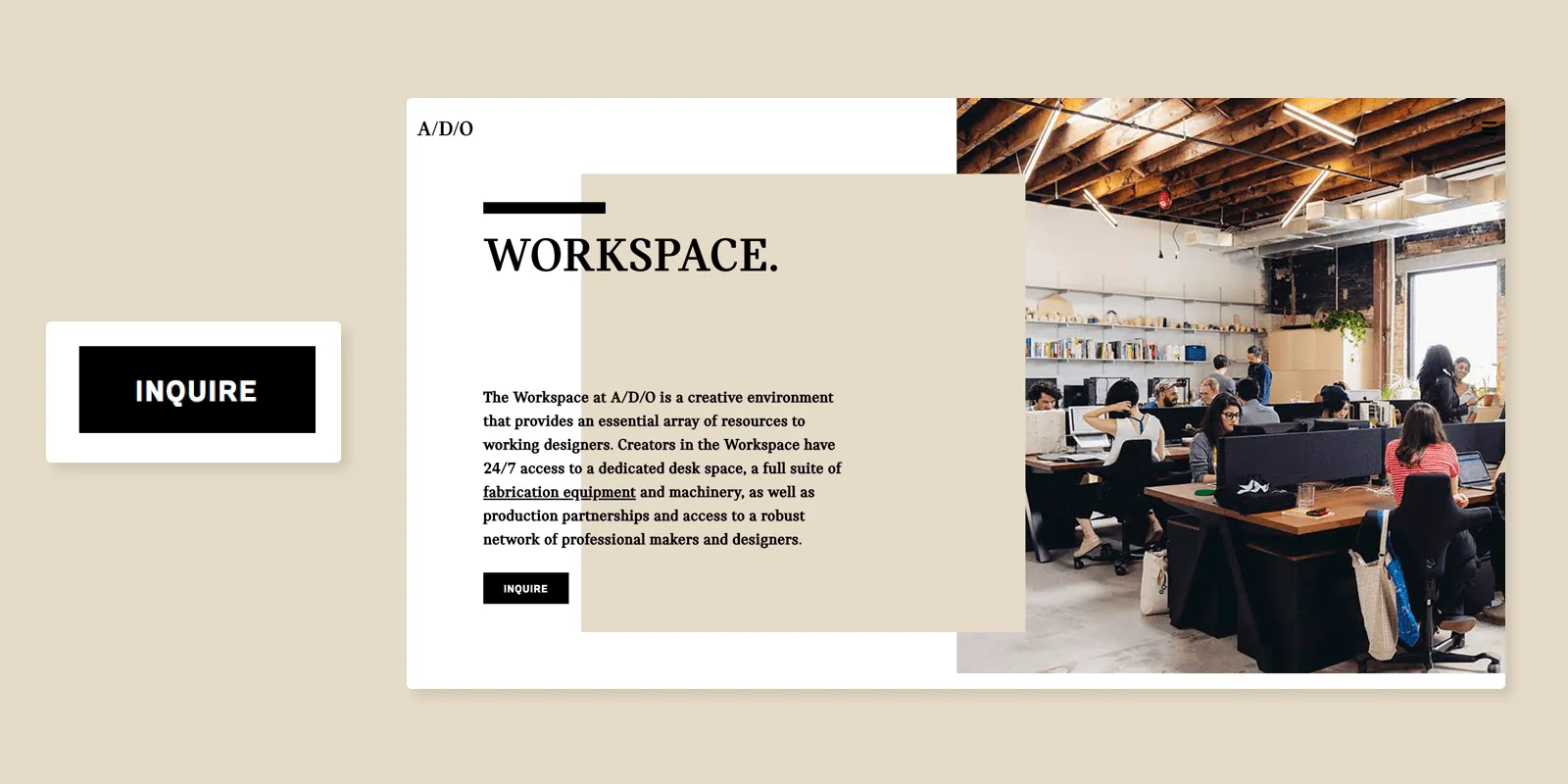
How do you make a good coworking CTA?

Determine what action you want users to take

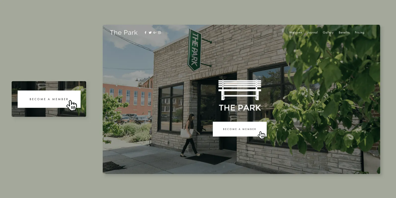
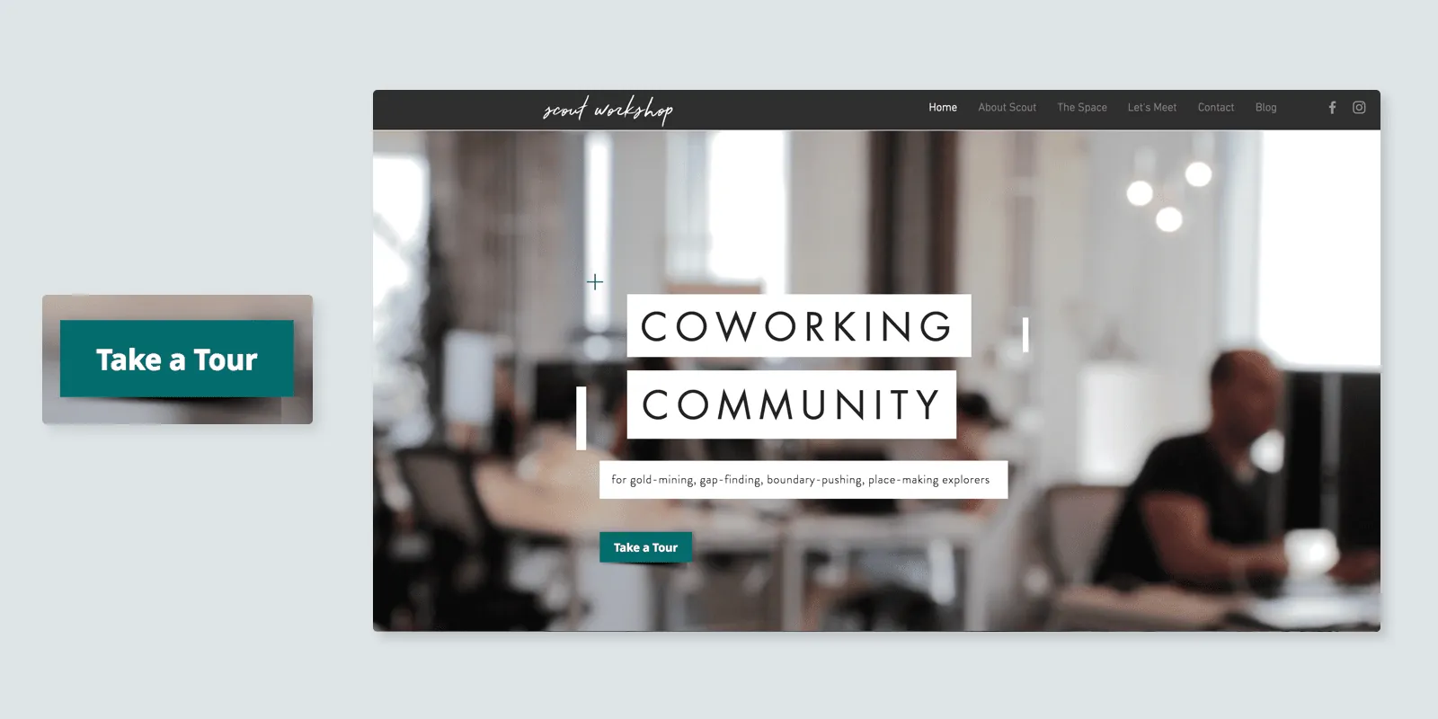
Some coworking brands put a lot of energy into creating a web experience that can market, sell and onboard new members entirely online. Others have a more ‘curated’ approach, educating website visitors on their membership packages, but only offering prospective members the ability to book a tour or submit an application through their website.

Ideally your website has a single, clear call-to-action. This avoids confusion and sets concrete expectations for visitors to your website. Once you know what you want prospective members to do when they land on your page, you can now start to optimize your CTA.

How to create high converting CTAs for your coworking website
One of our customers, A/D/O, helps to foster a sense of curiosity with an “Inquire” button that is the only clickable component in the hero section of their homepage.

Make your CTA stand out

One of the most simple pieces of advice to help your CTA buttons stand out is to ensure they actually look like buttons. Write your copy in a large, bold font, and leave space around the text. Adding a border around the text and setting a background color that has adequate contrast to the content that is behind it will help the button be unmissable.

How to create high converting CTAs for your coworking website
Our partner, The Park, keeps it simple, and adds a solid white ‘hover state’ to make their sign up CTA stand out.

Sometimes you may want to stray from the traditional button metaphor, that’s fine, as long as it’s on a background that makes sense given the content it sits on top of. CTAs that clash with the imagery behind them, or are poorly spaced, are difficult to spot for users.

How to create high converting CTAs for your coworking website

Write persuasive copy that encourages action

The best CTAs are clear about what they want the user to do – they inspire the user to take action without having to spend extra energy interpreting the message. Every word you use plays a role in either clarifying or complicating things for your audience.

How to create high converting CTAs for your coworking website
Our customer, Scout Workshop, uses a unique color on their “Take a Tour” button to catch the reader’s eye.

It’s a common trap to want to explain in detail what your button does. Do your best to include only the essential words, otherwise your CTA is going to become hard to read and much less likely to be clicked.

Another great tip is to write copy in the first person. We’ve seen brands increase their conversion rates by double digit amounts (in one case we saw a 90% increase in conversions!) by using the first person (i.e., me, I) rather than second person (i.e., you) in their button copy.

Emotions play a huge role in driving people’s buying behavior, so writing in the first person may be a tactic that helps users to feel more invested and emotionally connected to your brand.

How to create high converting CTAs for your coworking website

Your website is oftentimes the first experience prospective members have with your brand – it plays a critical role in shaping their perception of your brand and what you are offering. Take a moment to review your homepage with these tips in mind, and make a plan for any updates you need to make.