5 Contact Page Pro-Tips to Help You Attract New Members
Learn how to optimize your contact page to maximize your conversion rate!
May 1, 2018

In an increasingly competitive coworking market, where website visitors have ever-decreasing attention spans, it’s imperative that you make it easy for people to find what they are looking for. Everyone’s first instinct is to start by optimizing their home page, CTAs and any other landing pages they manage. The contact page, however, is a crucial piece of the digital marketing puzzle and is often one of the most viewed pages on a coworking site. Therefore, the contact page is a huge opportunity to convert prospective members.
Without further ado, here are five slip-ups many coworking spaces make, and how you can avoid or overcome them.
You’d be surprised how many websites don’t have a contact page at all. In lieu of a clear way to contact the company, some brands will display their social icons at the top of the page. Although it is always recommended that you promote your social channels, without a contact page, you will be redirecting any visitors who are looking to join your community to another platform. This leads to more distractions and can create frustration, ultimately increasing the likelihood your visitors “bounce” before buying.
Pro tip: Create a simple contact page today. You’ve invested so much in creating a great experience throughout the rest of your website. Complete the puzzle with this one last crucial component! You can read through the rest of this post to get ideas that will help you avoid common pitfalls as you create your page.
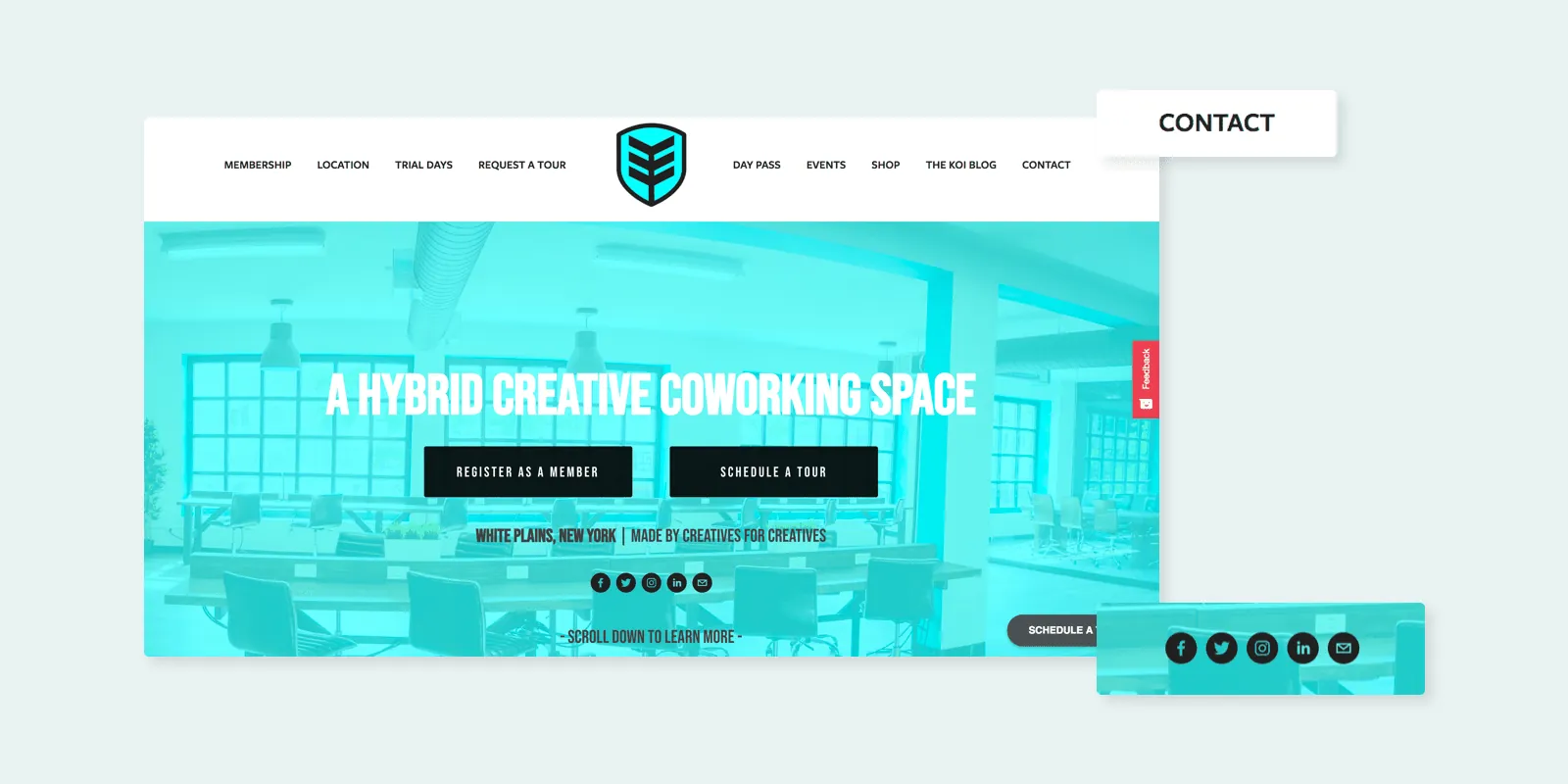
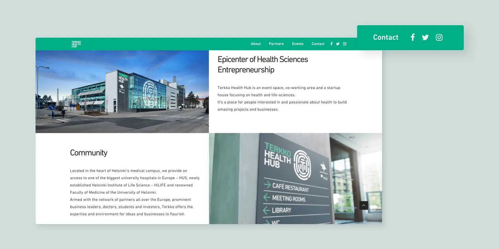
You’ve probably played the annoying game of “how do I get in touch with this company”. This game entails—you guessed it—searching for the contact page so you can reach out to the people behind the website.
Much like the coworking brands with missing contact pages, some do have one but it’s hidden away in the footer of the page, or some other internal page. If visitors can’t find it, it’s as good as not having one at all.
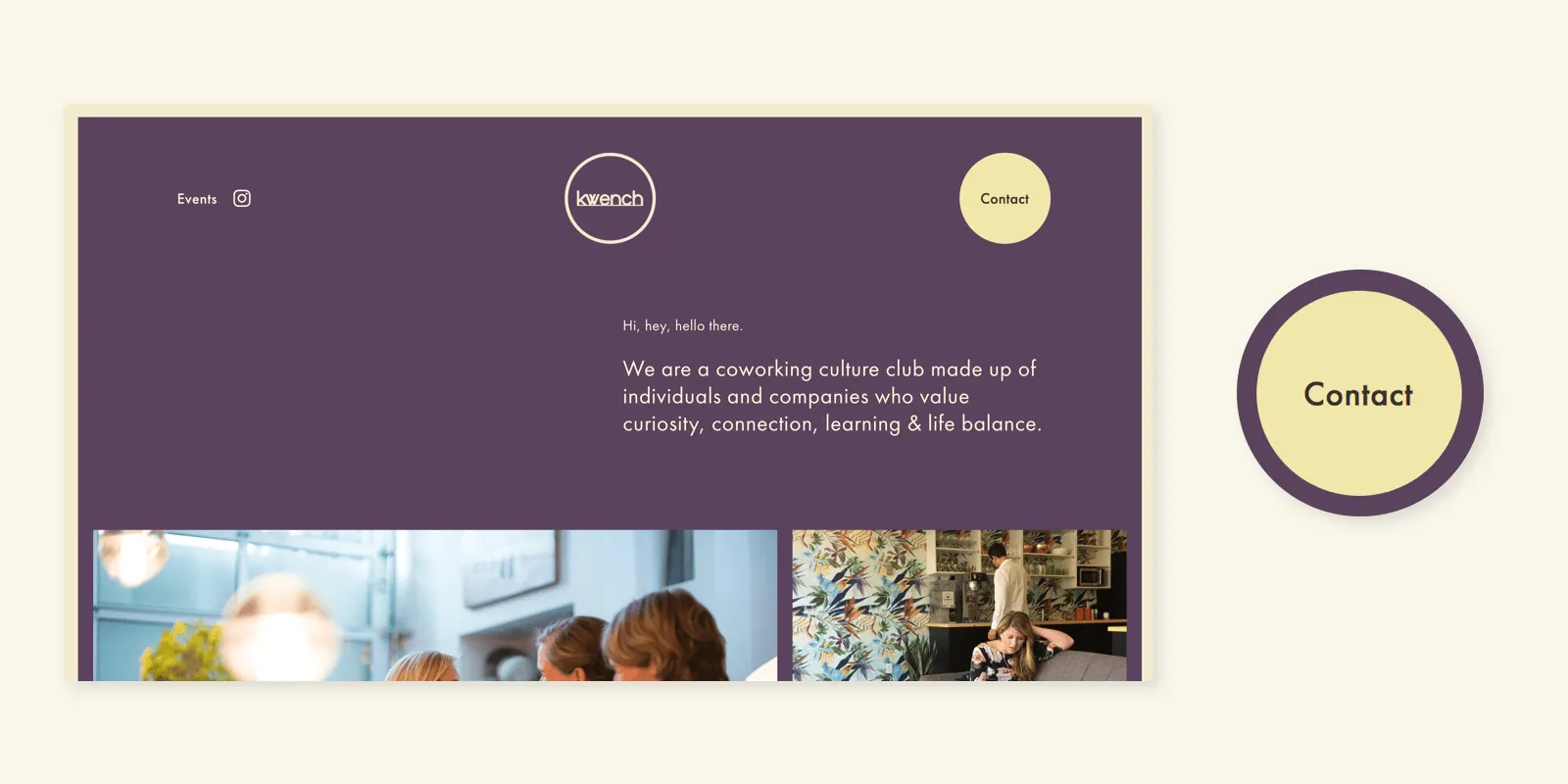
Pro tip: Your contact page should always be in the top navigation menu. Don’t get too fancy with it. Call it something obvious, like “Contact Us”. If you want visitors to get in touch before they check out your coworking space you may even experiment with having your contact page as your main website CTA.
If you want visitors to fill out a form to book a tour of your coworking space, you need to decide how much information you want to collect about that person. Contact forms usually fall on either end of a spectrum – they either don’t capture enough information, or they request some unnecessary details.
People’s time and patience are limited, so you want to be as efficient as possible. On the other hand, if you don’t collect enough information you may not have what you need to most effectively engage with a potential customer and provide a high quality of service.
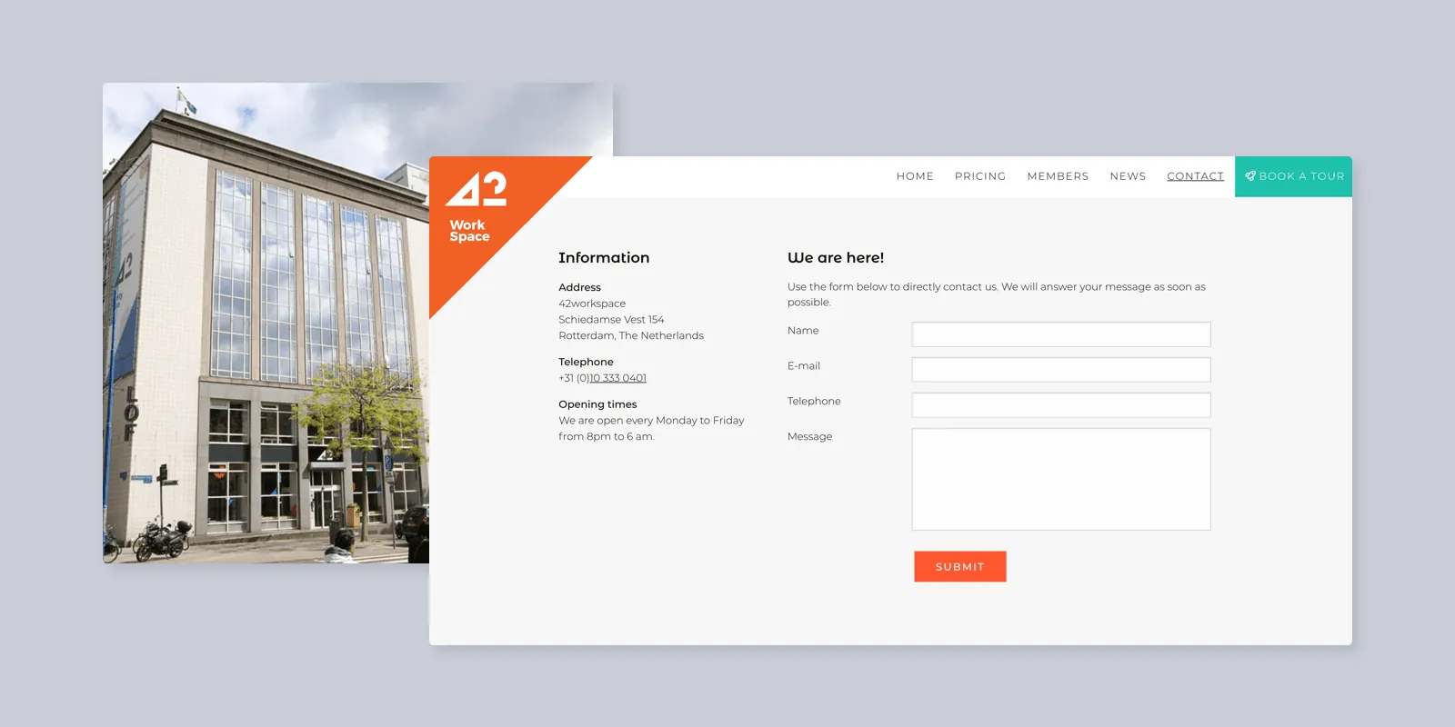
Pro tip: Collect as much information as you need about the person to get in touch with them if they don’t show up, and no more. If that means just a name and email, then you just need only those two fields. However, sometimes a question or two that exemplifies the culture and values of your brand can go a long way in qualifying the person and ensuring there is a good fit.
The most likely reason people are looking to get in touch with your space is to come and see it for themselves before they pay you for a membership. So, of course, they need to know where your space is located!
Some of the most effective coworking contact pages have beautiful maps to help visitors get oriented around the venue’s location(s). Embedding Google Maps data is free, and a simple way to answer one of the most important questions a new lead will be asking themselves – is this coworking space in a convenient location for me?
This is especially important if your organization has multiple locations. By having a map that pinpoints all of your locations, your clients evaluate which venue(s) which would be most convenient for them.
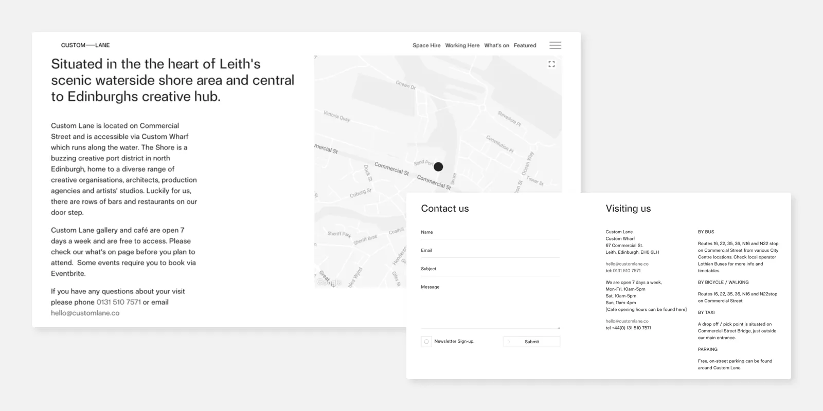
Pro tip: Don’t just have an address on your site. Embed a Google Map with a pin on your location,enabling visitors to visualize where you are in relation to their home and any other spaces they frequent. If you want to go the extra mile, highlight the best transit options and maybe even the Walk Score for your venue!
The community is a large part of what makes your coworking space special and appealing to prospective members. The contact page is a good place to show some of those social aspect and link out to your Instagram or Facebook profiles where users can explore the culture more. Keep in mind that your social media channels can also serve as powerful social proof.
If you don’t have an Instagram feed already, it’s not too late to start. Create one now and shoot a few high-resolution images of your space in good lighting. That being said, if you are new to social media, make sure that you can carve time out to manage and update your social channels on an ongoing basis. You want to avoid a stale Instagram account with only a handful of photos from last year!
Pro tip: Take a consistent, curated approach to engaging your audience through social channels. Instagram is a fantastic medium for coworking brands due to the visual nature of the platform and even has an embed feature where you can automatically embed your latest posts into your page. Place whatever social profiles you do have in your contact page and navigation section, as well.
The contact page on a coworking website plays a surprisingly important role – it’s the bridge between your potential customers and you, so it needs to be easily accessible and provide the most essential information. Take some time to review your contact page (or create one if you don’t have one already) and see if you can leverage the tips we have provided above.
To continue learning about how you can optimize your coworking website, read our latest posts on creating powerful CTA buttons and leveraging social proof to attract more members.