Blog

15 Coworking Space Website Examples That Will Make You Swoon

Inspiring your website creation process
By Kelly K
July 17, 2025
A split-screen image: on the left, a clean, white “Book Meeting Room” widget shows two room options (“Meeting Room B” and “Meeting Room A,” each seating six, with address and 11:00 AM/11:30 AM time buttons and a “More” link). On the right, three coworkers—one standing and pointing at a laptop while another holds a coffee cup—gather around a table in a bright, plant-filled café-style workspace.

Curious how to build a stellar website for your coworking space? We’ve compiled 15 inspiring examples from Optix clients who’ve mastered the art. Along with following website best practices, these websites leverage powerful Optix tools like Web Widgets and Automations to boost conversions. Click through to discover their secrets and elevate your own online presence!

Bad Company

Welcoming | Creative | Community‑focused

The top section of a coworking brand’s homepage: a beige nav bar with logo, menu links (“Members Collective,” “Meeting Rooms,” “Hot Desking,” “Journal,” “Contact”) and a red “Book Now” button, overlaid on a full-width photo of a blue building façade, with the slogan “DO GOOD BUSINESS, WITH BAD COMPANY.”
Source: Bad Company

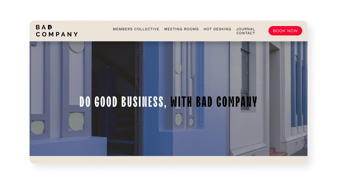
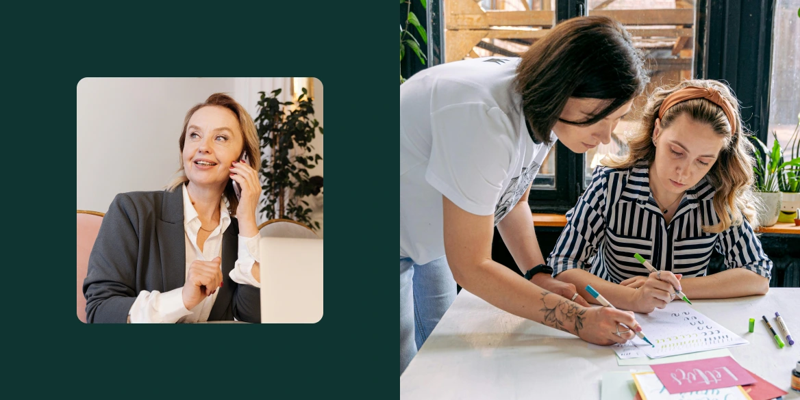
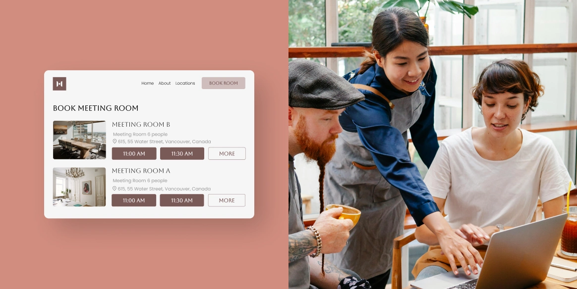
Bad Company is a shared workspace committed to human connection. Much like the space itself, the homepage champions a strong sense of community with testimonials, hosted events, and casual “coffee‑train” banter with a lived-in camaraderie that makes work feel social.
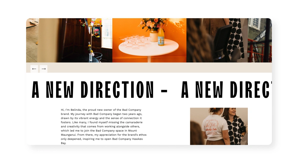
  • The site highlights rare natural light and modern, clean-finished interiors, mixing heritage character with bright, airy work zones
  • Multiple locations are unified under a flexible booking system, making user experience smooth and modern
A split-screen site header showing “A NEW DIRECTION” in bold stencil text overlaid on a scrolling carousel of interior photos, with a short founder’s story paragraph and small inset image of two people talking.
Source: Bad Company

Key takeaway:

Fuse space and story. Emphasize communal zones and regional character in visuals and copy to convey warmth and heritage.

See how Bad Company grew from one to three locations.

Barnfox

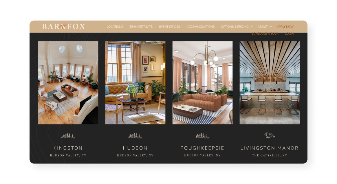
Boutique | Serene | Rustic-chic

A warm-toned layout featuring two interior venue photos flanking a mobile phone mockup of an “Accord House” booking page, with text below reading “Beautiful Flexible Workspaces” on the left and “Full-Service Retreat & Event Venues” on the right.
Source: Barnfox

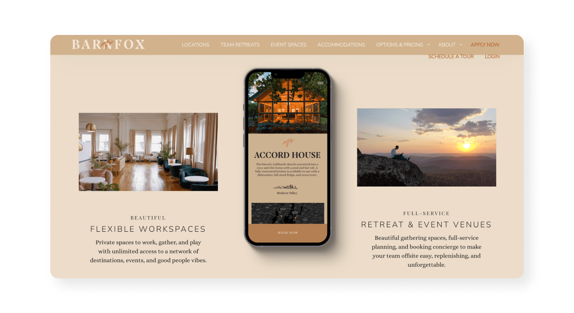
Barnfox boasts an elegant, experience-oriented brand that comes through as soon as you land on their site. The homepage makes you feel like you’re in a cozy retreat, positioning Barnfox as the bridge between nature and productivity that they are.

  • It blends lifestyle elements with workspace offerings, showcasing the value of both communal kitchens and fiber‑optic internet
  • Through stories and press mentions (like from Inc.), it highlights its founding narrative while strengthening their overall brand
A dark-themed gallery section showing four vertical photos of rustic workspace interiors labeled “Kingston,” “Hudson,” “Poughkeepsie,” and “Livingston Manor” in the Hudson Valley and Catskills.
Source: Barnfox

Key takeaway:

Show variety in space functionality. Feature multiple workspace formats (lounges, phone booths, private rooms) plus lifestyle touches (kombucha taps, event photos) to communicate versatility and help users find their home.

Bounce Space

Eclectic | Energetic | Playful

A soft-peach and olive header with the Elevate logo and nav links, left-aligned text reading “Elevate was designed for women…,” and on the right a photo of four smiling women standing together in a studio backdrop.
Source: Bounce Space

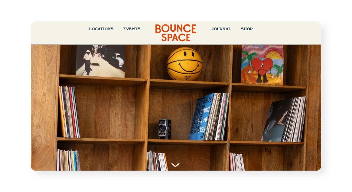
Bounce Space is a multi-location coworking community in the Netherlands with a unique look and feel. Their site showcases a wide variety of creative settings from old factory cafés and barber shops to even a sailing ship, signaling a fun mix of work and play.

  • The “Our Story” messaging is bold and honest, positioning BounceSpace as a refuge from the corporate ‘nine to five’ drudgery and a home for creative doers
  • The site functions as a living platform, with clear location pages, flexible booking options, and a vibrant events calendar
A light-cream header labeled “JOURNAL” above two portrait images side by side: one of a man in overalls labeled “Dion,” and one of an older man in sunglasses labeled “Willem.”
Source: Bounce Space

Key takeaway:

Speak directly to your audience’s mindset. Messaging like “not for everyone… energized by creative doers” attracts the right ICP better than generic marketing speak.

Elevate Coworking

Feminine | Cozy | Empowering

A soft-peach and olive header with the Elevate logo and nav links, left-aligned text reading “Elevate was designed for women…,” and on the right a photo of four smiling women standing together in a studio backdrop.
Source: Elevate Coworking

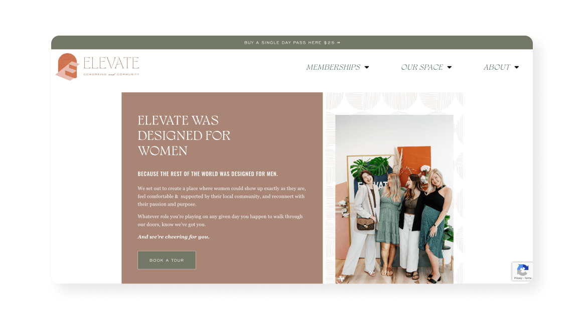
Elevate Coworking is a women-centric coworking community in North Carolina that is cozy, fun, and focused on community—just like their website. It clearly defines its audience right from the bold homepage statement, conveying a mission-driven atmosphere focused on women empowerment.
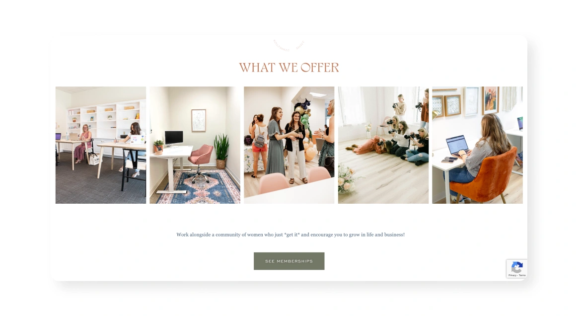
  • The visuals and tone strike a warm, homey-boho style with soft pinks, cozy spaces, and practical perks
  • Member-first features like day passes, memberships with meeting credits, and virtual mailboxes are presented transparently and accessibly
A “What We Offer” section showing five side-by-side photos of women working, meeting, and creating in bright, pastel-toned coworking rooms, with a “See Memberships” button below.
Source: Elevate Coworking

Key takeaway:

Focus on thoughtful, small touches. Much like your coworking space, it’s the little things that make the biggest difference on your website, like beautiful photos and quotes from your community.

See how Elevate Coworking powers their community with Optix.

Flockd

Bright | Refreshing | Holistic

A minimalist hero section on a white background reading “Gold Coast Favourite Creative Coworking Space,” with the word “FLOCKD” in large cut-out letters showing workspace imagery behind.
Source: Flockd

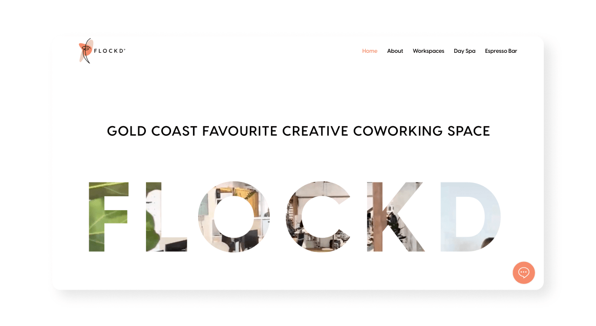
Flockd is an Australian-based coworking community with a commitment to wellness. Their website features a light-filled and airy design, mirroring the spacious, high-ceiling interiors of the physical space and carrying Flockd’s aesthetic into its digital presence.
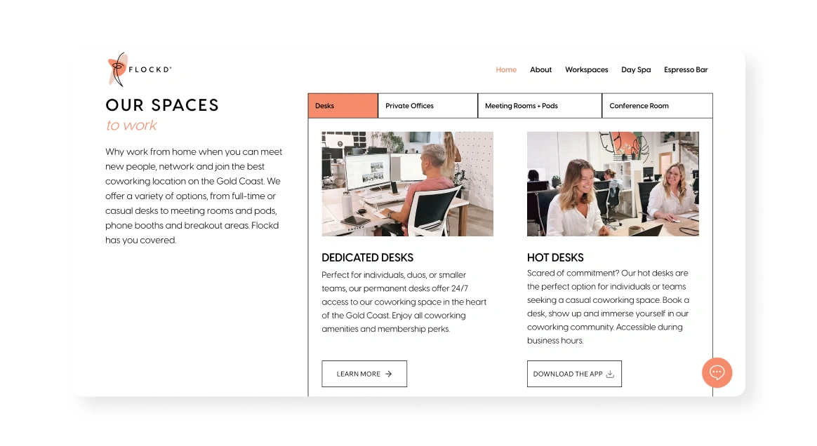
  • The Flockd site prominently features Day Spa treatments, an Espresso Bar, massage services, and even a beer garden, selling a full well-being and productivity ecosystem
  • Tour booking is easy and straightforward with an Optix form embedded directly onto their website – leads are then shared with the Optix admin dashboard
A clean white layout titled “Our Spaces to work,” left column of descriptive text, and two images on the right: one of a seated woman at a dedicated desk and one of two women collaborating at a hot desk, with tabbed links above for “Desks,” “Private Offices,” “Meeting Rooms + Pods,” and “Conference Room.”
Source: Flockd

Key takeaway:

Design consistency matters. Translating a bright, greenery-rich physical space into the website (through visuals and tone) makes for a cohesive and authentic story.

Boost your website’s conversion with Optix.


Woman working in a coworking space

Gravitate

Contemporary | Flexible | Bright

A pale-green header with Gravitate logo and nav links, a subheading about community, and a large photo of people chatting on tiered seating, overlaid by bold text “wifi & coffee & people & space.”
Source: Gravitate

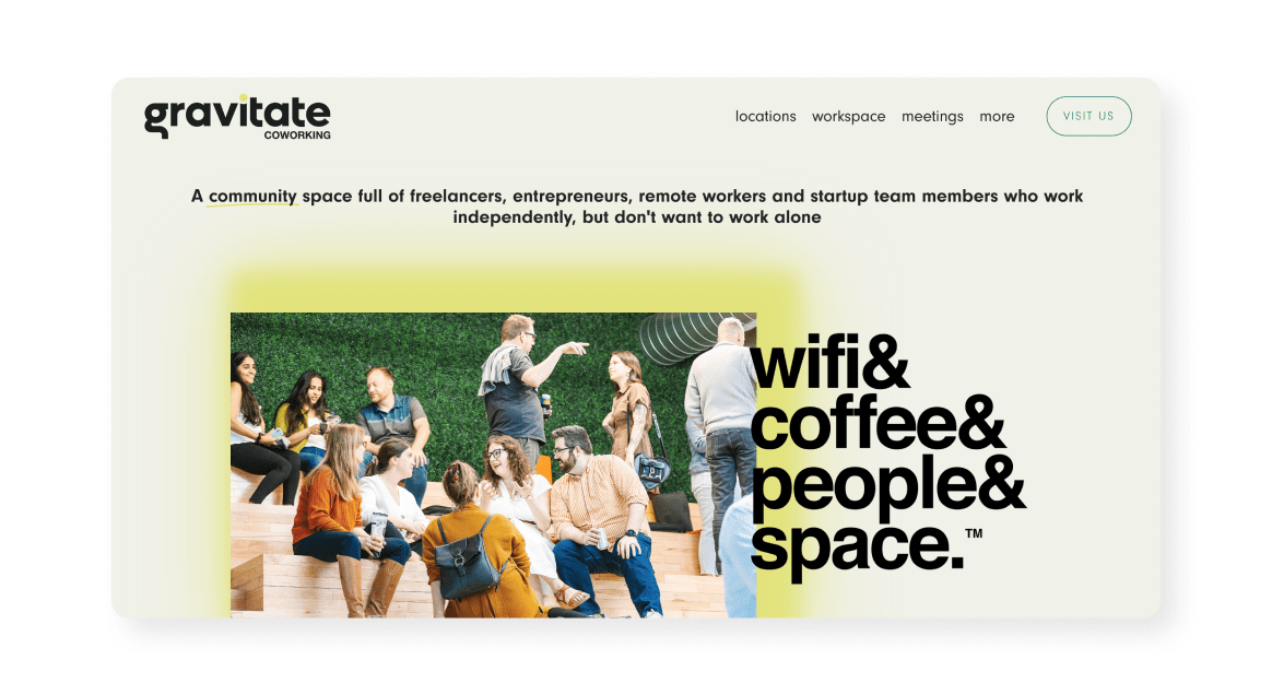
Gravitate is an Iowa-based coworking network that has made quite the mark on the flex space industry. The homepage conveys a modern, light-filled environment with playful design touches like hexagonal flooring, an abundance of glass, and airy skylights, all with a strong community vibe.
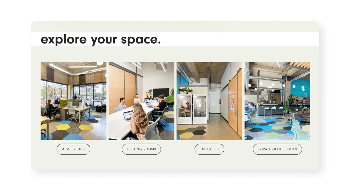
  • The content emphasizes community and flexibility presented in an honest, member-first tone
  • Member testimonials are front and center, highlighting real personalities, social value, and functional perks that people actually want
A muted-green “explore your space” panel showing four vertical photos of different coworking zones (open desks, a meeting table, a phone booth, and lounge area), each labeled beneath (“Memberships,” “Meeting Rooms,” “Day Passes,” “Private Office Suites”).
Source: Gravitate

Key takeaway:

Put community voices first. Well-curated testimonials humanize the brand and reinforce both social and functional value.

Learn more about Geoff’s path to growth, and how technology has made all the difference.

Highland City Club

Cultivated | Luxurious | Exclusive

A neutral-tone hero section titled “A Securus Locus” with subtitle text about Boulder’s premiere social and business club and a black “Explore Membership” button, atop a faint graphic of coworking tables below.
Source: Highland City Club

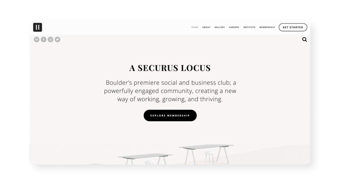
Highland City Club (HCC) is an institution in Boulder, and they’ve been serving their community with an elevated experience for many years. Their website expertly shows the story of HCC, including the heart of the property, a beautifully restored and impeccably maintained 129‑year‑old building.

  • The narrative blends community values (a safe place for passionate and caring people) with clear lifestyle benefits including massage, spa, fine wine, and an amphitheater
  • Site features like concierge options and clear community standards showcase both design intention and user thoughtfulness
A grid of twelve small images showing architectural details, landscapes, and interior greenery, arranged in three rows of four, as part of a gallery showcase.
Source: Highland City Club

Key takeaway: 

Lean into place and heritage. Highlight unique architecture, gardens, and history to differentiate your coworking identity.

Learn how Highland City Club takes their brand to the next level with tech.

Index

Authentic | Creative | Transparent

A clean white section with large serif address text “120 Walker 3rd Floor NY, NY” on the left and on the right a photo of a frosted-glass door opening into a bright coworking space, with nav links repeating below.
Source: Index

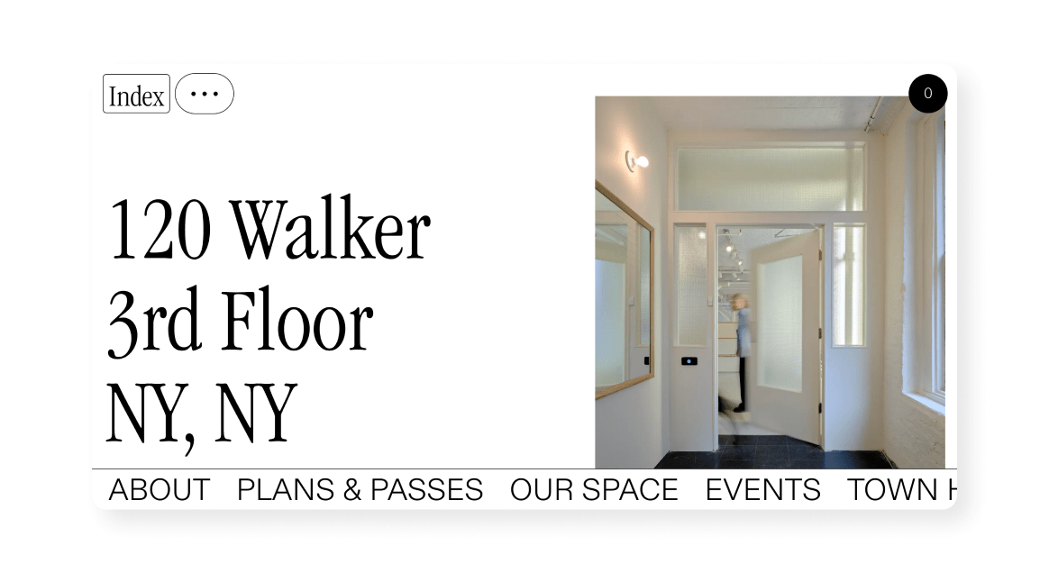
Index is a shared studio and coworking space for creatives with an original website to support their unique brand. Their homepage spotlights a tactile, design‑forward image, signaling that this is a hands-on makerspace rather than a sterile work environment.
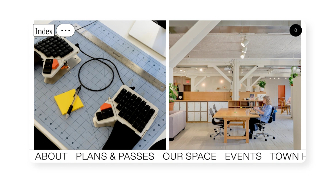
  • Their ethos of open finances and sharing costs right on their homepage promotes transparency in a way rarely seen in the industry
  • It promotes peer-led programming, workshops, and a global communal approach, reinforcing collaboration and creativity
A split-image header showing on the left a desk with a split mechanical keyboard and cutting mat, and on the right an airy coworking loft scene with a person at a long table, overlaid at the bottom by a horizontal nav (“About,” “Plans & Passes,” “Our Space,” “Events,” “Town Hall”).
Source: Index

Key takeaway: 

Be radically transparent. Sharing real costs and financials builds trust and positions your space as community-first rather than bottom-line-first.

KWENCH

Inviting | Vibrant | Thoughtful

A split view with a lavender-marbled left half reading “Work + Culture Club” in mint green type, and on the right three people chatting and working at a long wooden table against a backdrop of mint-green shelves.
Source: KWENCH

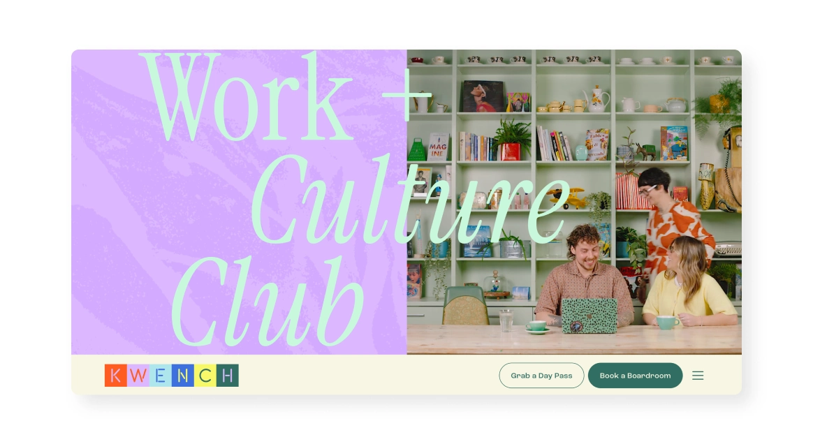
KWENCH has artistry embedded into their DNA, and it’s certainly reflected on their website. The homepage immediately welcomes you with bright colors and candid imagery that make you feel like you already belong.
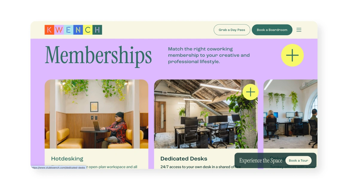
  • It clearly communicates the brand values and leans into its B-Corp and social impact credentials in an elegant way
  • The layout balances striking visuals with testimonials, amenities, and calls to action
A pastel-green and lavender layout titled “Memberships,” showing three side-by-side photos of: a person working at a yellow booth; a row of black desk chairs under a pitched ceiling; and three people at a window-lined workstation, each overlaid with a circular plus icon.
Source: KWENCH

Key takeaway:

Use real photos of real people. Authentic photos of people (and even pets) using the space communicate culture and community better than any stock photo ever could.

Learn how KWENCH is building a better experience for their team with automation.

Mountain Club

Alpine‑elegant | Experiential | Connected

A split section with a nighttime lakeside community scene above, and below left-aligned text “Where bold connections lead to big ideas,” with a “Join The Club” button and descriptive copy on the right.
Source: Mountain Club

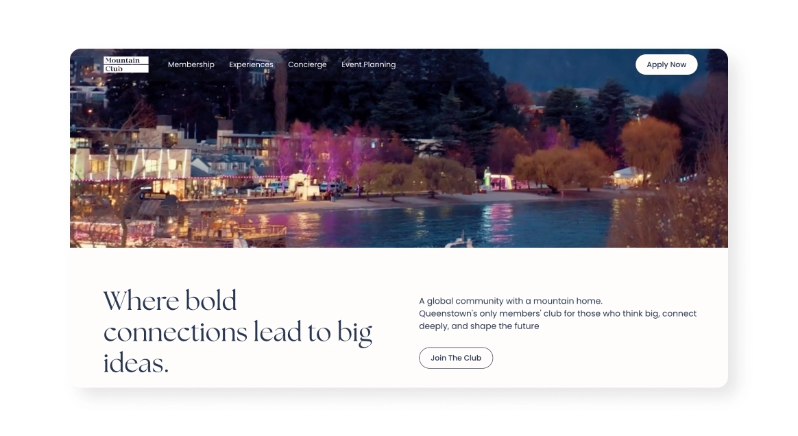
Mountain Club is a New Zealand-based coworking space that leans heavy into the world around them, both with their brand and their website. Their site blends breathtaking mountain‑side views with luxurious interiors for a workspace that speaks for itself.
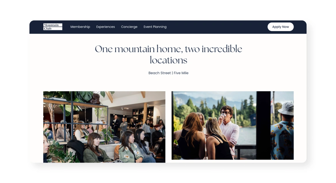
  • The site emphasizes its place as a  “members’ club”, mixing productivity with hospitality, adventure, and global networking
  • Details like on‑site barista coffee, shower facilities, and 300+ annual events demonstrate a premium, member‑first experience
A white header reading “One mountain home, two incredible locations,” above two photos side by side: a group seated in a lounge surrounded by plants, and people mingling beside a lakeside deck.
Source: Mountain Club

Key takeaway:

Turn surroundings into your centerpiece. Integrate your locale’s unique environment (like mountain views) directly into your design and website, making place a feature.

Q space

Clean | Functional | Modern

A bright image of a sleek communal kitchen in a coworking space, topped by a promo banner reading “Experience the serviced office advantage with two weeks free on us!” and a nav bar with Q-SPACE logo and links above.
Source: Q Space

Q Space is a coworking community in New Zealand that’s focused on modern professionalism, just like their website. This homepage leads with a crisp welcome message paired with photos of bright interiors, communicating warmth and productivity.

  • The site emphasizes flexibility with a transparent two-week trial and streamlined booking making user onboarding frictionless
  • A strong sense of community is woven in through regular events, networking workshops, and ongoing member lunches
A white “Testimonials” section displaying four portrait photos and accompanying quotes from users, each labelled with name, title, and feedback.
Source: Q Space

Key takeaway:

Use trial offers to lower barriers. The two-week free trial plus mobile-friendly booking shows confidence in your service and encourages commitment.

See how community manager Deanna Hoy manages 160+ members all by herself.

Stories

Calm | Nurturing | Professional

A split section with left-aligned serif headline “Welcome your clients with trust, care and connection” and application button, and on the right a warm photo of a row of wooden chairs in a softly lit room, plus navigation links and a star-rating below.
Source: Stories

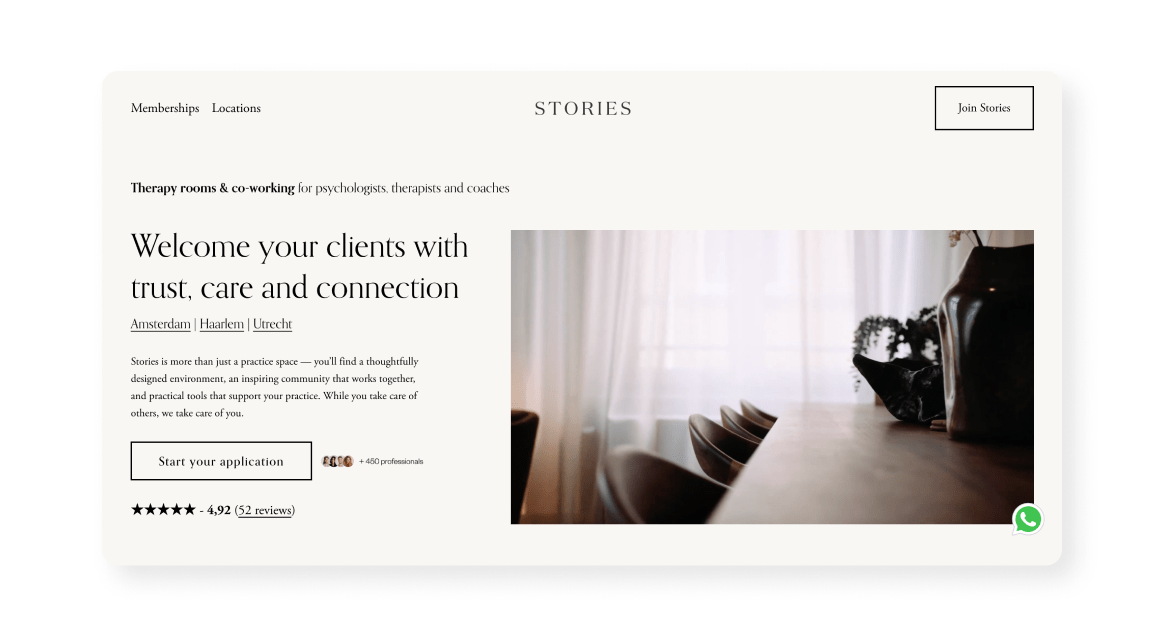
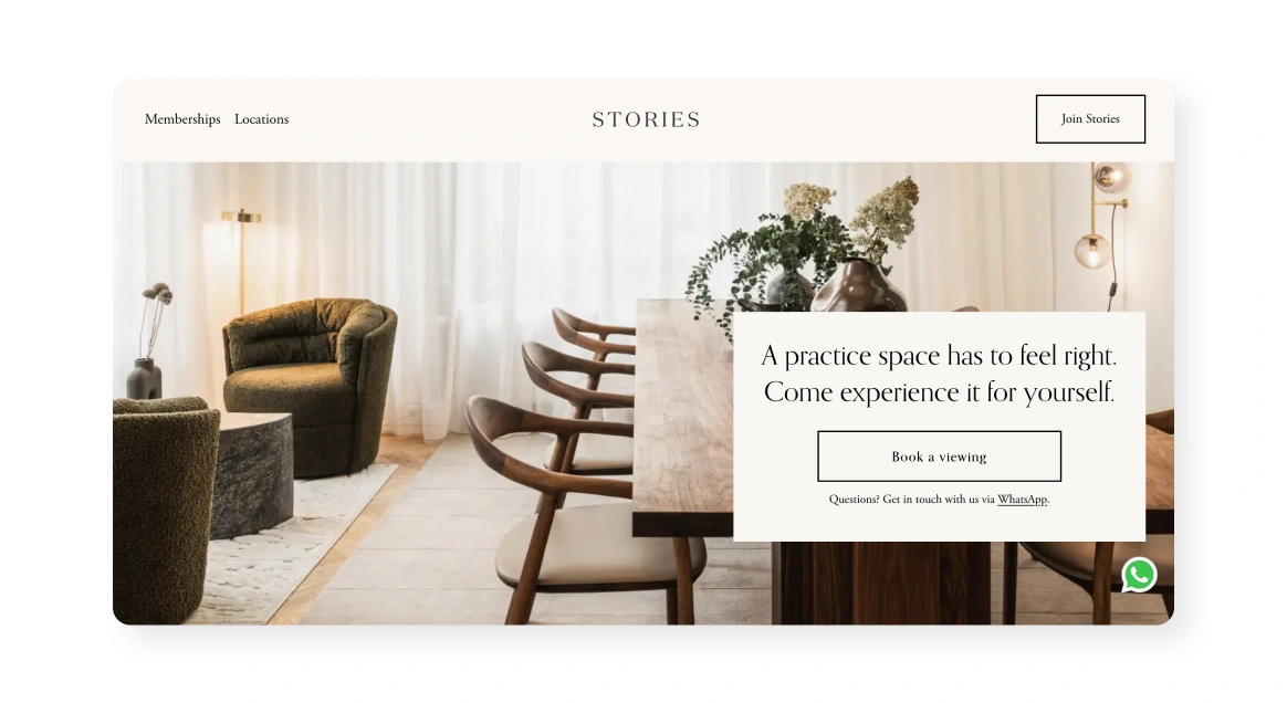
Stories is a collection of coworking spaces for therapists designed with professionalism and care in mind. The homepage conveys a coveted sense of calm, using warm, natural materials perfectly fitting for therapists and their clients.

  • It clearly defines its niche, focusing on community support, peer connection, and practical tools for therapists and psychologists
  • The combination of elegant photography and dynamic memberships position Stories as a caring, professional, and modern sanctuary for mental health practitioners
A light-cream hero section titled “STORIES” showing a lounge area with plush chairs and wooden table, and an overlaid white callout box reading “A practice space has to feel right. Come experience it for yourself,” plus a “Book a viewing” button.
Source: Stories

Key takeaway:

Design for your audience’s emotional state. Use soft textures, natural elements, and gentle lighting to create an environment that feels safe and calm for users.

Salon22

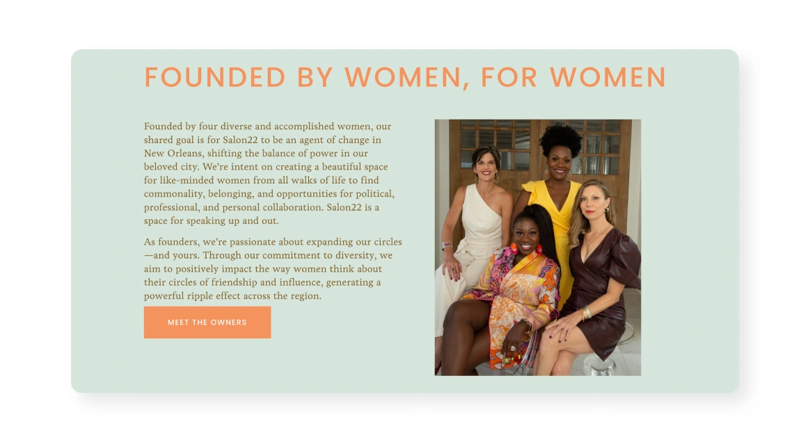
Empowering | Elegant | Purpose‑driven

A dark-teal hero section reading “For women, for the future” with subtext “A salon for the twenty-second century,” featuring two orange buttons “Schedule a Tour” and “Become a Member.”
Source: Salon22

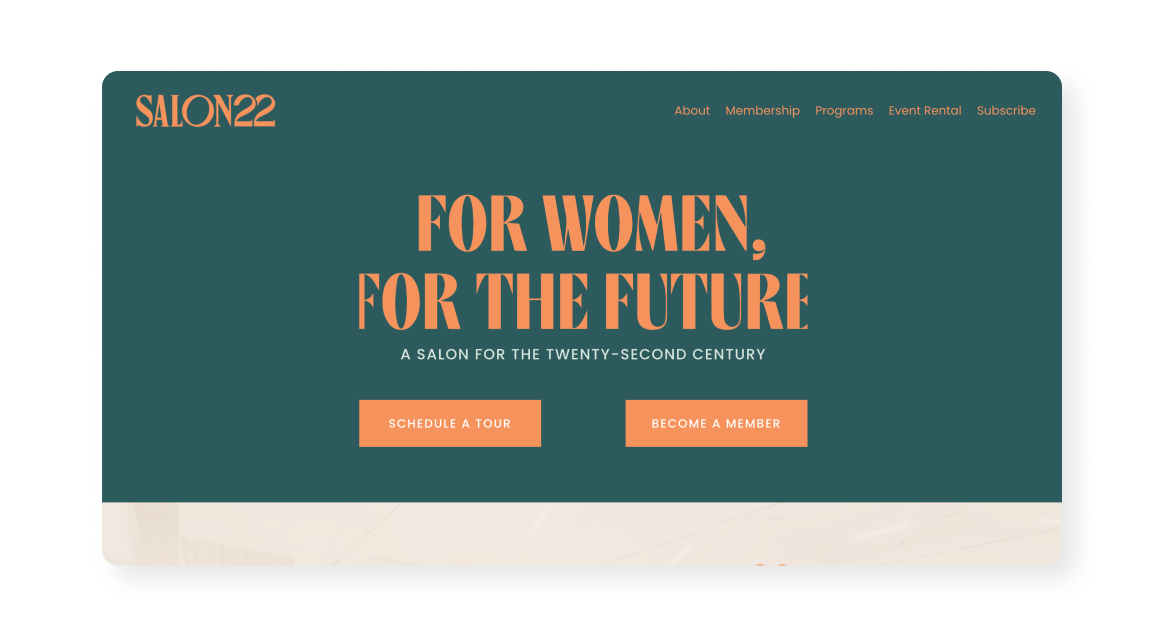
Salon22 is a coworking community and social club for women in New Orleans, Louisiana. Their homepage targets women-leaders with clarity, setting a visionary tone around gender equity and bold futures that’s consistent with the Salon22 brand.

  • The site interweaves coworking, events, and coaching all nestled in a beautifully restored sanctuary space featuring stained-glass windows and cathedral ceilings

It excels at community-focused programming: from wellness book clubs to “Get Sh*t Done” coworking parties and clothing swaps

A mint-green panel titled “Founded by women, for women” with text about founders on the left and a portrait of five women seated and standing together on the right, plus a “Meet The Owners” button.
Source: Salon22

Key takeaway

Own your mission loud and clear. Define who you serve, why you exist, and what future you’re building. Then let this guide both visuals and messaging.

Learn how Salon22 empowers a community of women entrepreneurs with Optix.

1880 Bardo

Sophisticated | Refined | Dynamic

A full-width serif headline “Inspiring conversations that change the world” in black on a light-cream background, partially overlaid on a blurred image of bokeh lights beneath.
Source: 1880 Bardo

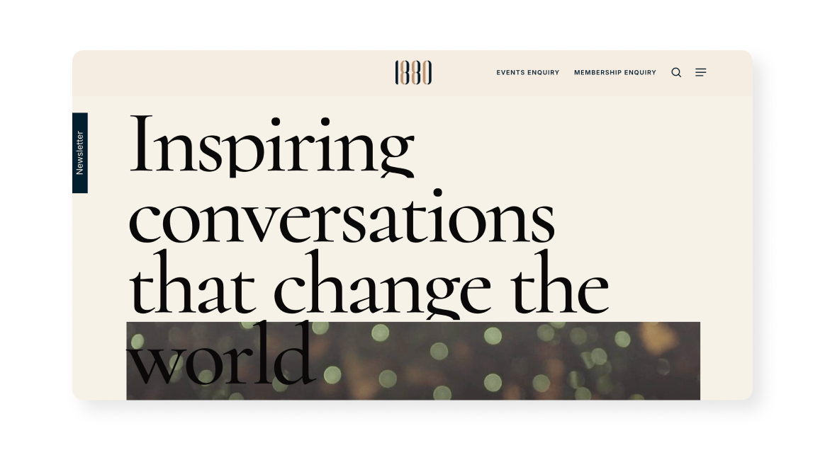
1880 Bardo is a work and social club all about intelligent conversations and meaningful connections. Their homepage conveys this salon‑style atmosphere with elegant wood finishes and lounge seating, striking a balance between coworking and social club luxury.
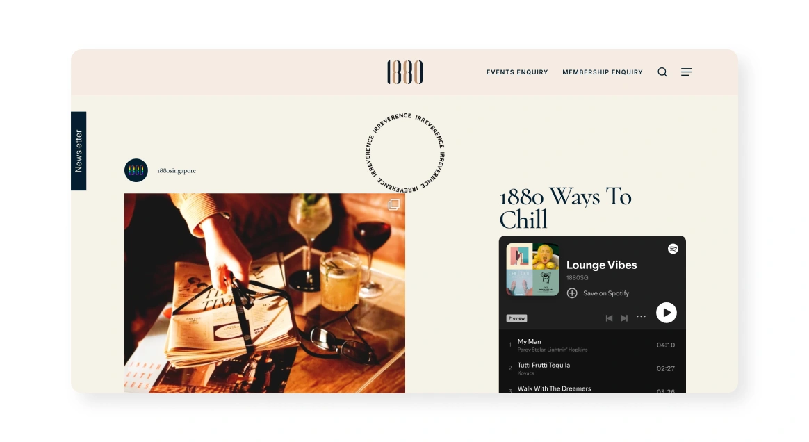
  • It clearly promotes a holistic experience (workspaces, spa, grooming) all well integrated to support a work‑life‑play continuum
  • The messaging (Inspiring conversations that change the world) offers an aspirational, purpose‑driven identity beyond traditional coworking
A cream-toned header with “1880” logo at center and nav links “Events Enquiry,” “Membership Enquiry,” search icon, and menu icon on the right. Below, a split layout shows on the left a close-up of someone arranging cocktails on a table beside wine glasses; on the right an embedded Spotify playlist titled “Lounge Vibes” with album art and track list.
Source: 1880 Bardo

Key takeaway: 

Use aspirational copy to define culture. Phrases like “diverse minds” and “inspiring conversations” elevate the site from functional coworking to an intellectually engaging club, while speaking directly to their ICP.

221A

Art‑centric | Community‑led | Eco‑conscious

A minimalist header with “221A” and “MENU” buttons, below a bold oversized “221A” watermark across the screen. Beneath, three columns: left shows a circle-seated discussion group under a woven wall hanging; center shows a modern apartment block at 187 E 3rd; right lists an upcoming “Drop-in at Co-working” event with date, time, and brief details.
Source: 221A

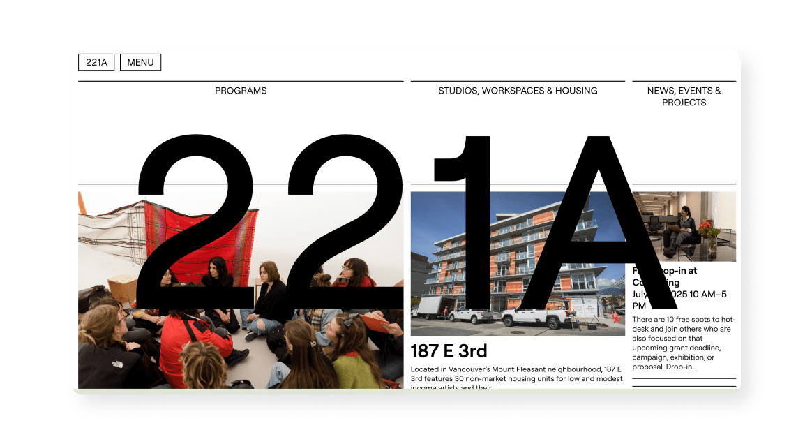
221A is a communal space featuring artist studios, coworking, housing, and gallery space all located in Vancouver, British Columbia. Much like the business model, the homepage is an eclectic mix of community infrastructure and creativity presented in a unique and interesting way.

  • The site is refreshingly open about structure and finances, detailing a cost-recovery leasing model, a 60‑year head lease, and its non‑profit, artist-first mission

The programming speaks to a global, socially driven approach, positioning 221A as a research-driven cultural infrastructure organization
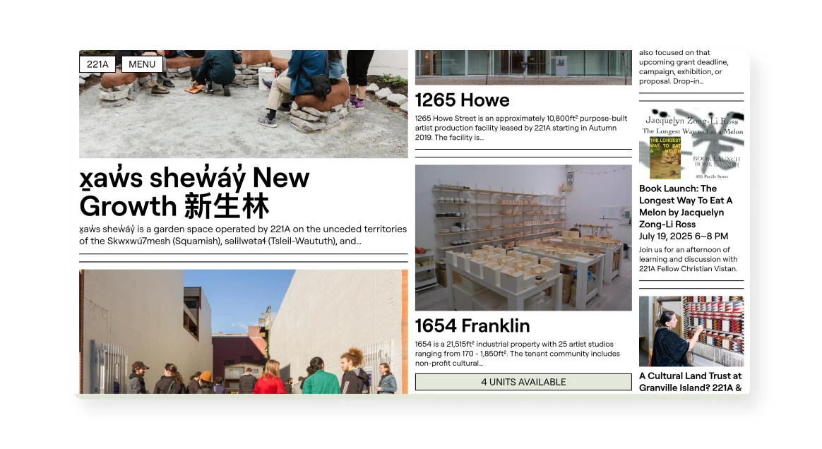
A dense magazine-style grid featuring a large headline in English and Chinese “x̱a̱ws shewáy New Growth 新生林,” a wide photo of people walking through an outdoor artist courtyard, and two right-column panels: one titled “1265 Howe” with a building photo and text, the other “1654 Franklin” with an interior studio photo and “4 UNITS AVAILABLE” banner, plus a slim rightmost strip of upcoming event listings.
Source: 221A

Key takeaway:

Communicate your broader impact. Beyond what you would expect in a coworking space, emphasize programs, residencies, public arts, and eco-conscious features to show your space as a cultural hub, not a commodity.

Optimize your website with Optix

Now that you’ve seen how 15 coworking spaces are creating incredible online experiences with their website, do the same for yours. Discover how you can use Optix to make it easier for prospective members to schedule a tour, book a day pass, or inquire about a membership, all with an easy-to-use no code tool.

Learn more in the video below or connect with a member of our team today to see it in action.

Frequently asked questions

A high-converting site highlights your value, shows off your space, and drives action. Include clear messaging, professional visuals, strong CTAs, and easy navigation. Mobile responsiveness is a must.

SEO is very important for coworking spaces. Most people still find coworking spaces through online search. Optimizing for local keywords like “coworking space in [your city]” can boost visibility. Don’t skip meta tags, headings, and Google Business Profile setup.

Your homepage should quickly explain who you are and what you offer. Include a strong headline, visuals, service highlights, social proof, and a clear CTA (like “Book a Tour”). Make it scannable and intuitive.

Yes, images are extremely important. Photos and videos let visitors picture themselves in your space. Focus on real people, daily activity, and key amenities. A virtual tour can also drive more tour bookings.

Use tools like booking forms, live chat, and email opt-ins to capture leads. With Optix, you can automate follow-ups and keep track of key CRM information without needing to integrate with another tool.